
Image
Source
Hannah Ritchie and Max Roser (2019) - "Air Pollution". Published online at OurWorldInData.org. Retrieved from: 'https://ourworldindata.org/air-pollution' [Online Resource]
Language
English
Contributor(s)
Group Audience
English
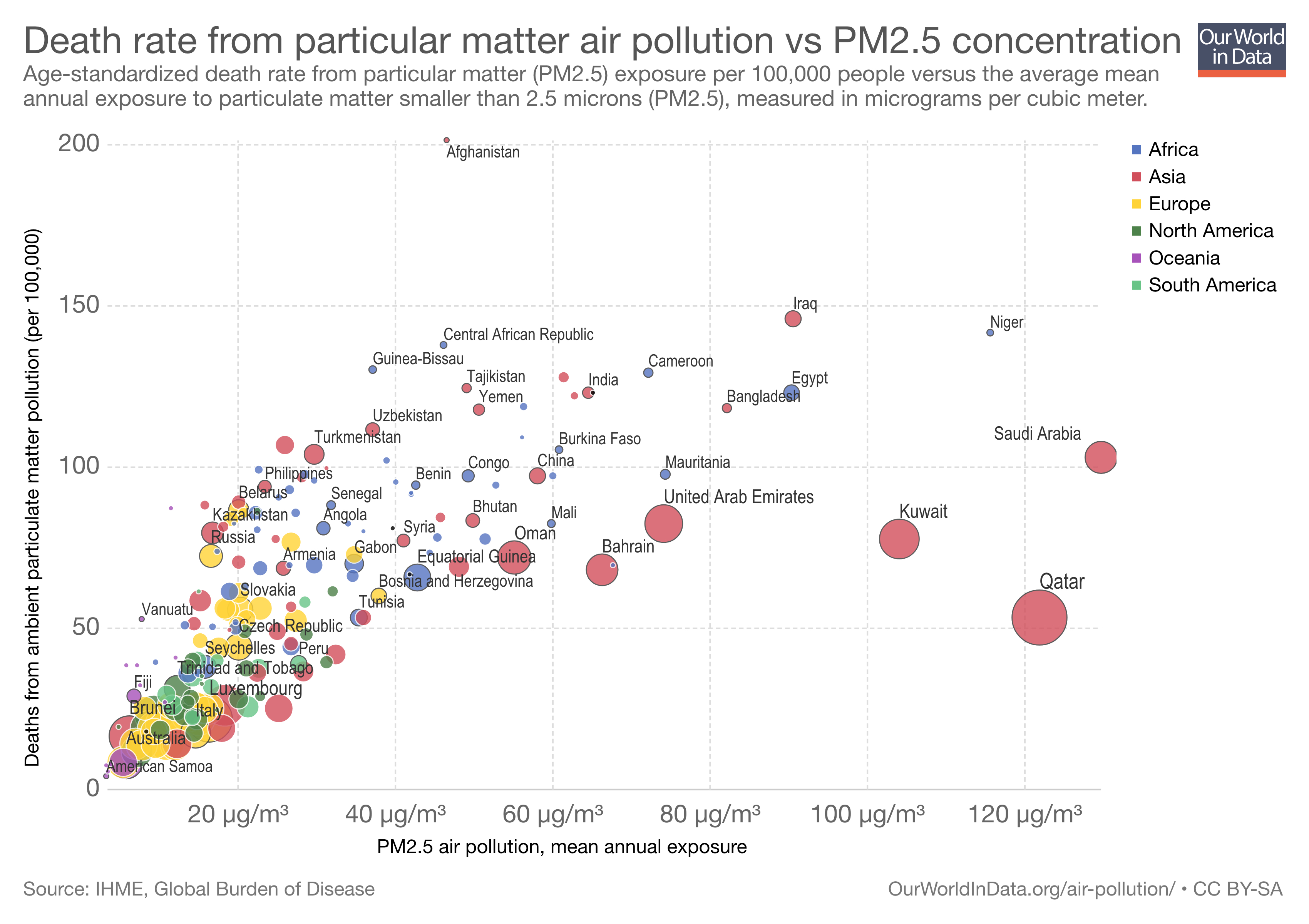
Caption: This visualization of air pollution data is more recent, and shifts us to a different scale and kind of analysis. Where the previous image focused on a particular air sample gathered at a particular place (Los Angeles) and a particular time (September 3, 1969), analyzing its components according to particle size and surface area, here the underlying data sets are more global, charting national death rates from PM2.5 (the y-axis) against mean annual PM2.5 exposure (the x-axis). The nations are also color coded by continent, and coded again according to GDP (the size of the circle). The interactive visualization allows you to foreground different patterns in the data.
This particular data visualization signifies the potentials held by large public health data sets -- so dependent on data limitations, modeling parameters and assumptions, and other factors that simultaneously power and limit analysis -- less for finding answers, and more for their ability to generate new questions and prompt imagination and insight. Clicking around on different parts of the graph and key shows some of these potentials: why are all the South American countries (in green) so tightly grouped? Why are Asian countries so splayed all over the graph? Is there a better explanation than "Money for cleanup!" for all those nations clustered down toward the graph's zero points?
And we can also see - or at least, see that there is a question to be posed - that high PM2.5 exposures do not necessarily correlate directly to increased death rates. The many Gulf states that appear as large (wealthy) reddish circles out toward the right end of graph, representing the highest PM2.5 exposures, also have comparatively low death rates -- no worse than Iran, really, with its infamous air pollution, and much, much better than Iraq. (And Afghanistan is, literally, almost off the chart.) Is it because PM2.5 in Saudi Arbaia, Kuwait, or Qatar is mostly cleaner fine sand particles rather than hydrocarbon-laden particles from cars and industrial facilities? Or because they are wealthy enough to be managing the situation somehow, through better health care or otherwise?
Design statement: Data visualizations like this are used to produce and explore patterns in “Big Data.” They can (and should) be critiqued as limited, reductive, and otherwise subject to the vicissitudes of measurement, but this can also prevent anthropologists from reading for their productive potentials--not least as generators of new questions. Working with Gregory Bateson’s understanding that information is about “difference that makes a difference,” we can see how operationalizing the carefully characterized and organized differences that constitute large data sets--here, annual exposures to PM2.5 in different nations, their differential death rates, and their differential wealth -- can be used to produce new comparisons, hypotheses, and questions.