
Image
Source
Hannah Ritchie and Max Roser (2019) - "Air Pollution". Published online at OurWorldInData.org. Retrieved from: 'https://ourworldindata.org/air-pollution' [Online Resource]
Language
English
Contributor(s)
Group Audience
English
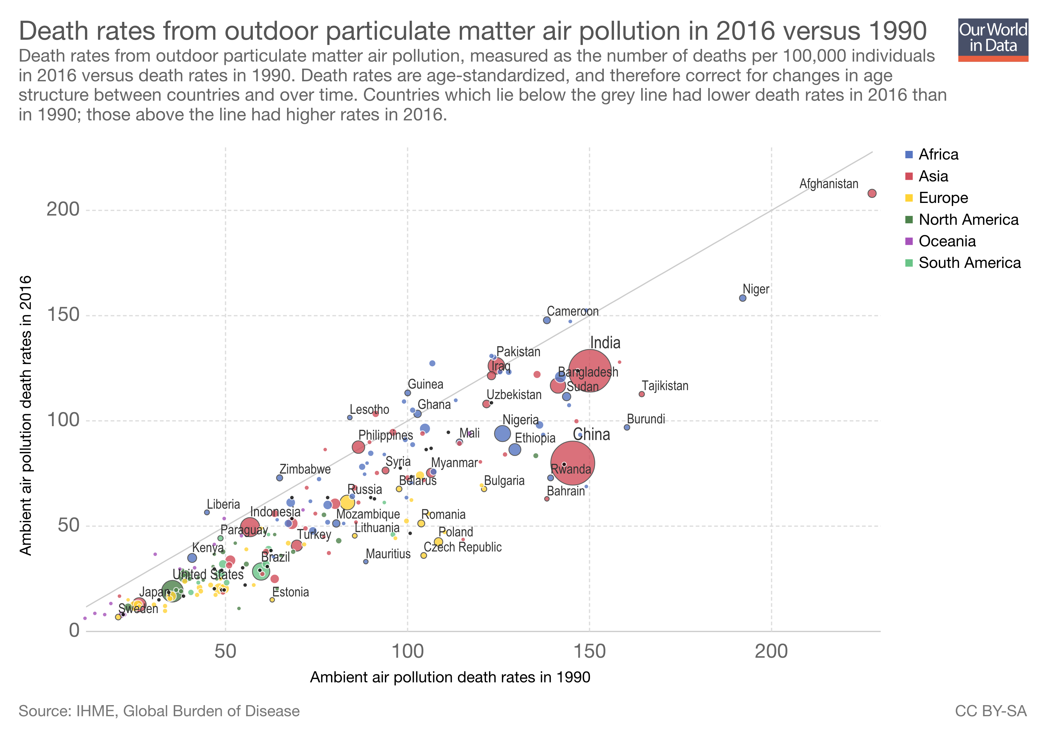
Caption: Another interactive graph from the "Our World In Data" site. This one uses data from the Institute for Health Metrics and Evaluation (IHME) in a fairly simple plot: PM2.5-attributed death rates per 100,000 individuals in 2009 (the x-axis) versus those same death in 2016 (the y-axis), with nation-states again color coded by continent and sized according to GDP. The bisecting line going up through the middle represents no change -- indeed, no progress: the same number of people dying from air pollution in 2016 as seven years previously. It's thus easy to see, by virtue of being below that line, that the vast majority of nations have indeed made at least some progress. The further down from that mid-line a nation is, the more deaths have decreased there, and the more progress that has been made -- relative to this one metric, anyway.
In significant swaths of (medical) anthropology, the hegemonic attitude towards "data" and especially "Big Data" largely coheres around indifference, skepticism, or flat-out oppositional critique. The very idea of "metrics," like those produced and analyzed by organizations like the Institute for Health Metrics and Evaluation (more or less equivalent, for some, to saying "the Gates Foundation"), seems to elicit strong reactive statements about the superior qualities of qualitative data and interpretive analysis. Constructions of death rates like the ones depicted here, or of "DALYs" (Disability Adjusted Life-Years) are troped as (I will now exaggerate and italicize) wonky instruments of colonial control that eclipse or erase the subtleties and nuances so crucial to the quotidian lives that anthropologists alone can access and authorize.
This kind of critique -- and it's not unjustified -- turns on a cluster of notions, however, having to do with data, analysis, and science as tied almost exclusively (I will exaggerate again) to truthful representation -- a logocentrism, if you will, that is hegemonic in the sciences but shared as well, even if unacknowledged or cut somewhat by the apparent alterity of a "humanism," in anthropology.
But data and quantitative, computational analysis have other uses and modes, and the visualization here points to some of them -- indeed, pointing itself is one such valuable function. Data visualizations like this one don't offer solid universal truths so much as re-direct the attention of scientists (including us), offer patterns to explore and ponder, and spark creative questioning. Here, for example, this simple graph asks us to ask: how can we understand the differences between China and India? Two nations with similar (enough) GDPs, similar (enough) states of industrialization, similar (enough) headline-making "airpocalypses" in recent years, and similar (enough) death rates in 2009, as easily evidenced by their positions near the "150" marker on the x-axis -- yet something happened in China that made its data-blob move much further down the y-axis, below that midline? China pushed -- somehow, on something -- and over the course of seven years lowered pretty dramatically -- more dramatically than India, at any rate -- the number of its citizens dying from lung-choking, heart-stopping, brain-eating air pollution. The data and its visualizations may not tell us a truth, but they do tell us that something real is happening that makes a difference and one way to name that real difference falls under the rubric of governance...
Design statement: Data visualizations like this are used to produce and explore patterns in “Big Data.” They can (and should) be critiqued as limited, reductive, and otherwise subject to the vicissitudes of measurement, but this can also prevent anthropologists from reading for their productive potentials--not least as generators of new questions. Working with Gregory Bateson’s understanding that information is about “difference that makes a difference,” we can see how operationalizing the carefully characterized and organized differences that constitute large data sets--here, changes in death rates due to PM2.5 exposure in different nations, with their differential wealth, at two different points in time -- can be used to produce new comparisons, hypotheses, and questions. It also conveys the difference that programmatic social action -- in this case, air quality regulation and remediation, informed by data and irs knowledges -- has made (or not) in different national governance systems.