
Image
Source
Yoo, Chae. 2018. “Created Image: Risk in Colors.” In Toxic Correspondence, created by Chaeyoon Yoo. In Visualizing Toxic Subjects Digital Exhibit, curated by James Adams and Kim Fortun. The Center for Ethnography. March.
Language
English
Contributor(s)
Group Audience
English
Caption:
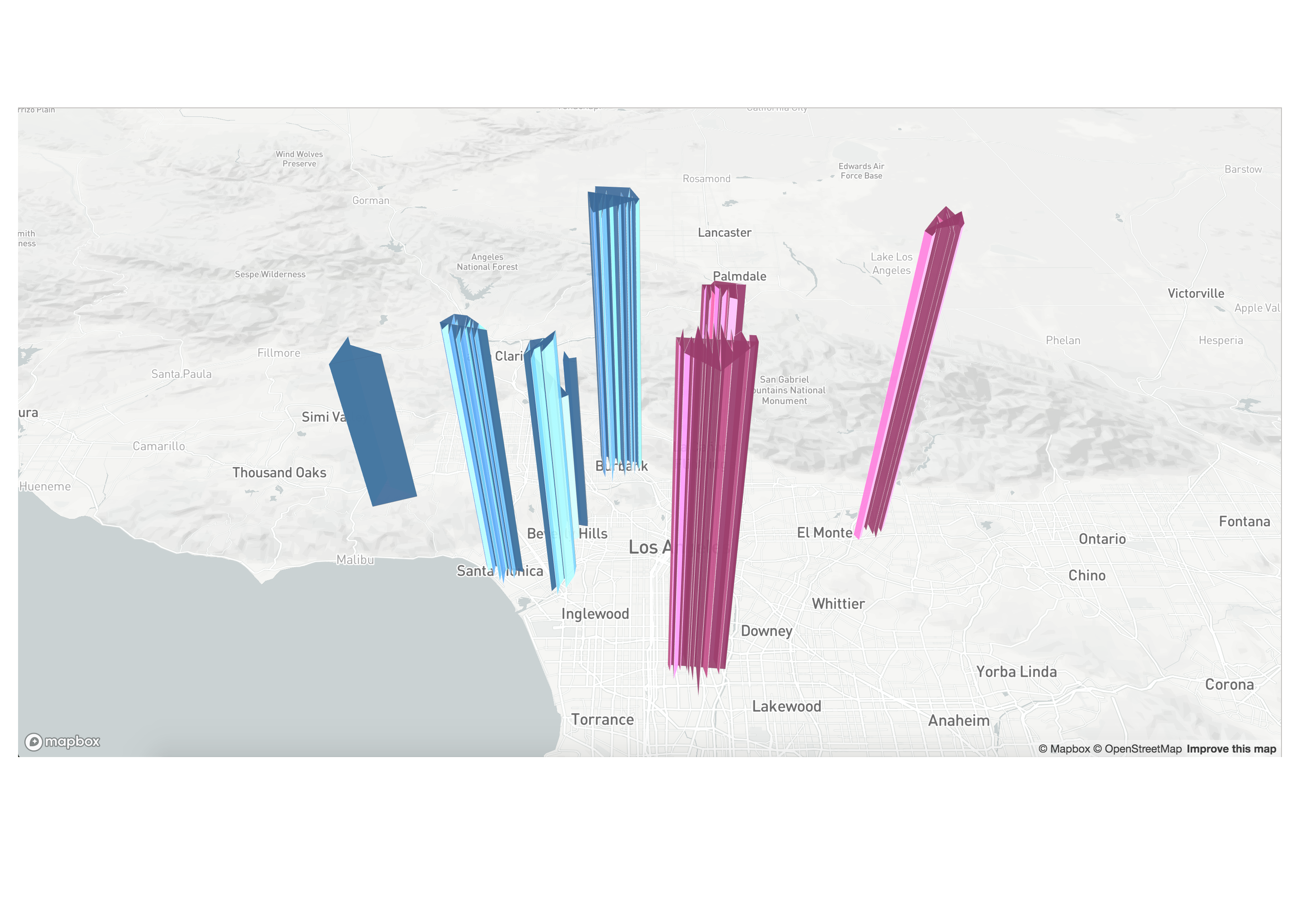
This is a data visualization of the CalEnviroScreen 3.0 Data released by OEHHA (Office of Environmental Health Hazard Assessment) in 2017. California Environment Screen is a California Communities Environmental Health Screening Tool that identifies California communities by census tract that are disproportionately burdened by, and vulnerable to, multiple sources of pollution. This data visualization utilizes longitude, latitude, CES score percentiles, and disadvantage community identification data. The height of the polygons represent the CES score percentile (the low the percentage the less there are environmental hazards) and the color of the polygons represent whether the neighborhood is predominantly identified as a disadvantaged community or not. The data visualization is a web-based application that utilized the Mapbox token as its base map. The layering was done through implementing Deck.gl.
Design Statement:
Risk and Vulnerability in Scale
I created this data visualization in order to provide a pollution visualization schema that focuses on the idea of ‘scale.’ Conventional data visualizations, especially geospatial visualizations, that deliver information about air pollution in Los Angeles tend to quantify emission data without pointing to how such hazards might affect neighborhoods quite differently. These visualizations convey correct information about air pollution (that pollution is higher in areas where major freeways pass by, etc) but without denoting the potential scale of its effects. For instance, the height of these polygons are not drastically different, which means that the CES score percentile themselves among these communities are not drastically different. While this means that environment hazard, including air pollution, is significant in all areas of Los Angeles, it does not guarantee that the effects of hazards are felt similarly across different neighborhoods as well. In order to represent this problematic, I decided to differentiate the colors of the CES score percentile according to whether the neighborhood is a disadvantaged community or not.